Interface Quality Review
Audited hierarchy, interaction states, density, and content patterns before launch so the product surface felt clearer, calmer, and more consistent.
The product was functionally close to launch, but the interface still felt uneven. Hierarchy shifted from screen to screen, interaction states were inconsistent, density was fighting readability, and small content decisions made the product feel less confident than the underlying work deserved.
The review treated visual polish as operational clarity, not decoration. The goal was to identify the design decisions most likely to affect comprehension, trust, and perceived quality before the product reached customers.

The review focused on the few visual systems that carried the most weight: page hierarchy, state language, spacing rhythm, table density, empty states, and error handling. This prevented the pass from becoming an endless preference exercise.
Each recommendation was framed as a product-quality decision. Instead of saying a screen “looked off,” the review explained what the inconsistency made harder to understand, which pattern should become standard, and whether the fix was critical, recommended, or safe to defer.

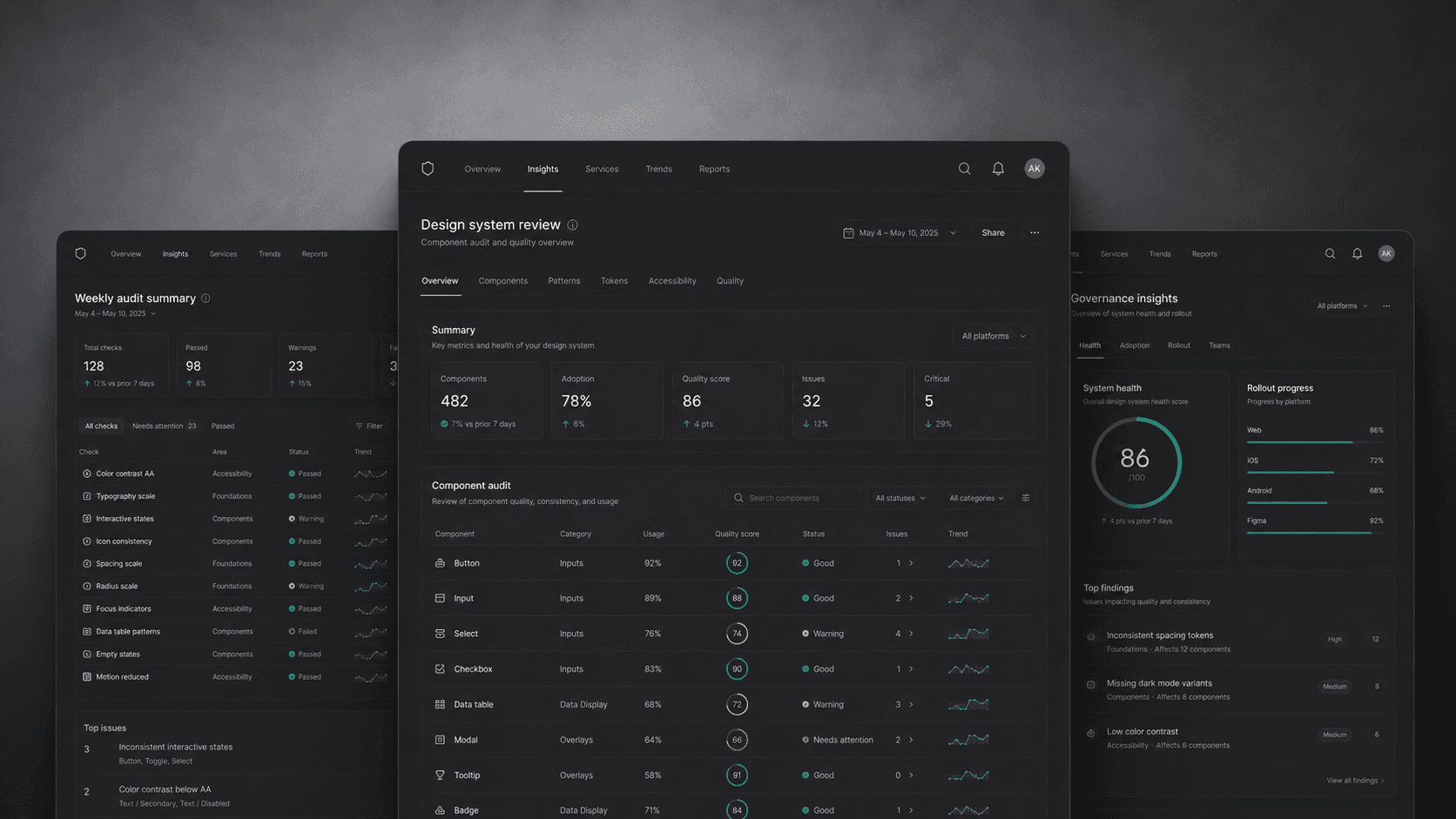
Supporting proof included side-by-side screen comparisons, state inventories, typography and spacing notes, content pattern examples, and annotated launch-risk callouts. These artifacts helped the team see that the issues were systemic enough to address but bounded enough to fix quickly.
The strongest evidence came from repeated friction across related surfaces. When similar tasks used different visual rules, users had to relearn the product unnecessarily. The quality pass made those mismatches visible and gave the team a practical path to resolve them.

The final pass gave the team a cleaner, more confident launch surface without reopening the entire product design. It improved hierarchy, reduced visual noise, and created clearer standards for interaction states and dense information views.
The reflection was simple: visual design earns its keep when it protects comprehension. The best polish is not cosmetic. It removes small doubts before they become trust problems.